





Want to know how to create reports and dashboards in Power BI? You've found the right post!
Here you will learn how to create your first dashboard.
In this post, we'll show you the step-by-step process to start using this powerful Business Intelligence tool and transform data into visual and strategic information for your company.
If you need to gather, analyze, and present data in a clear and professional manner, Power BI can be your greatest ally.
So come with us to find out. How to create a dashboard in Power BI!
What is Power BI?
O Power BI It is a platform of Business Intelligence (BI) focused on data analysis and the creation of interactive visualizations.
With it, it's possible to connect different data sources such as Excel, CSV files, online platforms (like Google Analytics, Meta Ads, RD Station, etc.), and thus transform this information into... dynamic reports and visual dashboards.
Due to its great flexibility, Power BI can be used in various sectors, such as:
- Marketing (to track campaign metrics);
- Finances (control of expenses and income);
- Logistics (monitoring deliveries and inventory);
- HR (monitoring goals and performance indicators).
Among many other companies.
What is a dashboard in Power BI?
One dashboard in Power BI is a visual and interactive interface which summarizes important information in a single panel.
Through graphs, tables, and indicators, it is possible to visualize data quickly and clearly.
Unlike lengthy and often complex reports, a dashboard offers a macro view of everything that is essential to the business. On it, you can:
- Compare data by time periods (such as month to month);
- Analyze key performance indicators (KPIs);
- View project paths and action histories;
- Monitor goals and results in real time.
Examples of elements in a Power BI dashboard:
- Line graphs showing sales trends;
- Performance indicators (e.g., monthly revenue);
- Maps showing the location of customers or branches;
- Dynamic filters by period, region, or product.
What is the difference between dashboards and reports in Power BI?
It's very common for people to confuse dashboards with reports, but they have distinct purposes within Power BI.
- Reports They consist of one or more pages with various visual elements (graphs, tables, etc.), and are sets of pages that detail the data more completely, allowing for in-depth analysis.
- Dashboards These are unique dashboards, composed of blocks that are typically visual elements extracted from different reports. They are concise and interactive, ideal for quick visualization and decision-making.
Read also: Computer engineering: what does it entail?
Types of dashboards and how to choose them.
Before creating a dashboard in Power BI, it's essential to define the objective of your analysis.
Each type of dashboard serves a specific business need — whether operational, strategic, or analytical.
Knowing how to identify the purpose of the dashboard helps in choosing the best metrics, visualizations, and data sources.
Next, you will learn about the main types of dashboards and understand when and how to use each one.
Operational Dashboard
O operational dashboard It is used in the team's daily work to monitor the progress of internal activities, tasks, and processes.
He presents real-time data or data with frequent updates, making it ideal for monitoring ongoing actions.
It's an essential dashboard for managers and teams who need to monitor productivity and ensure projects are on schedule.
Examples of metrics for operational dashboards:
- Sales made per day;
- Number of new customers;
- Tasks completed by team;
- Real-time website visits;
- Current inventory level;
- Daily production by sector;
- Support tickets opened and resolved;
- Average customer service time.
Subtypes of operational dashboards:
- Project Dashboard: It shows the progress of activities, percentages completed, those responsible for tasks, delays, and deadlines.
- Customer Service Dashboard: Tracks customer interactions via phone, email, or chat. Displays average response time, request type, satisfaction rating, and main complaints.
Strategic Dashboard
O strategic dashboard it is geared towards senior management and board of directors of the company. It helps visualize the organization's performance in the medium and long term and is essential for leadership to make decisions. decisions based on strategic data, setting goals and monitoring overall results.
This type of dashboard tends to be more concise, with key performance indicators (KPIs) that show the overall health of the business.
Examples of metrics for strategic dashboards:
- Company growth rate;
- Total revenue and net profit;
- Evolution of revenue in recent quarters;
- Financial performance by region or branch;
- Return on investment (ROI);
- Market share;
- Website traffic and sales conversions;
- Overall customer satisfaction (NPS).
Analytical Dashboard
O analytical dashboard It is more detailed and technical, geared towards Data analysts, BI professionals, and those in areas requiring in-depth knowledge. in the information.
It allows you to study data behavior, identify patterns, predict trends, and make decisions based on concrete insights.
These dashboards are useful when there is a high volume of information that needs to be cross-referenced and interpreted in greater depth.
Examples of metrics for analytical dashboards:
- Customer acquisition cost (CAC);
- Demographic and behavioral profile of the personas;
- ROI of specific campaigns;
- Sales projection for the coming months;
- Most accessed posts and content on blogs or social media;
- Churn analysis (customer cancellations);
- Comparison between acquisition channels (Google, social media, referrals).
How to create a dashboard in Power BI

The moment you've been waiting for has arrived!
After understanding what Power BI is and the different types of dashboards, it's time to get your hands dirty.
But, in the end, What is the first step in creating reports and dashboards in Power BI?
The answer is simple: Understand clearly what your objective is with the dashboard and what data you will be analyzing.
Before opening the program and starting to create charts, you need to plan. Define what will be measured, which KPIs will be used, and where the data will come from.
With that in mind, follow the step-by-step instructions below to create your first dashboard in Power BI:
1. Define the purpose of your dashboard.
Before taking any technical action, ask yourself:
- What do I want to analyze?
- Who will use this panel?
- Which decision should he support?
These answers will help you choose the right type of dashboard (operational, strategic, or analytical) and the most relevant metrics for your dashboard.
2. Choose and organize your data sources in Power BI.
One of the biggest advantages of Power BI is its flexibility to connect different data sources, This allows for the centralization of information from various areas in a single location.
Here are some examples of compatible data sources:
Local files:
- Excel (.xlsx, .xls)
- CSV files (.csv)
- XML, JSON
Cloud services:
- Google Sheets
- SharePoint
- OneDrive
Databases:
- Microsoft SQL Server
- MySQL
- PostgreSQL
- Oracle
- Amazon Redshift
- Google BigQuery
- IBM DB2
Marketing, sales, and customer service platforms:
- Google Analytics
- Facebook Ads
- Google Ads
- HubSpot
- RD Station
- Salesforce
- Zendesk
- Mailchimp
Other online sources:
- Custom APIs
- Web pages (HTML scraping)
- Microsoft Dataverse
- Azure Blob Storage
- Dynamics 365
These connections can be configured as Import (data loaded into Power BI) or Direct connection (DirectQuery), keeping the data always updated in real time.
How do I import data into Power BI?
- Open the Power BI Desktop
- Click on “"Get Data"” on the home screen
- Select the desired data source.
- Connect and import the data.
Important tip: Organize your data beforehand to make creating the dashboard easier. Avoid messy spreadsheets and review the quality of the information.
3. Transform and model the data using Power Query.
After importing the data, the next step is to clean, transform, and model the information.
Use the Editor of Power Query to:
- Correct errors and remove duplicate data;
- Rename columns and rows;
- Create custom columns;
- Change data types (text, number, date, etc.);
- Relate tables.
This step is crucial to ensure your dashboard functions correctly.
4. Create relationships between the tables (data modeling)
If you are working with more than one table, it is necessary to create relationships between them. This allows you to cross-reference information and generate more complete analyses.
In Power BI:
- Go to the “Modeling” tab.”
- Drag and drop related fields between tables (e.g., customer ID, product code).
5. Create visualizations and compose your dashboard.
Now it's time to bring your dashboard to life! In the Power BI visualization panel, you'll find various chart types, such as:
- Columns;
- Bars;
- Lines;
- Geographic maps;
- Tables and cards;
- Data segmentation (interactive filters).
Design your dashboard layout based on the data and indicators defined at the beginning. Use visual elements that make it easy to read and avoid visual clutter.
Tip: Highlight key KPIs with more visible charts and use color to guide the user's eye.
6. Add interactivity to your dashboard.
One of the biggest advantages of Power BI is its interactivity. You can allow the user to:
- Filter the data by time period, region, product, and more;
- Click on a graph and see its reflection in the others;
- Export or share customized reports.
Use resources such as Segmentation, visual filters, and navigation buttons. to make your dashboard dynamic.
7. Publish and share your dashboard.
Finished your dashboard? Now you can publish and share it with your team!
- Click on “"Publish"” in Power BI Desktop;
- Select your workspace in the Power BI Service (cloud);
- Generate a sharing link or set access permissions.
If desired, it is also possible to schedule automatic data updates.
What is the ideal data modeling for creating reports in Power BI?
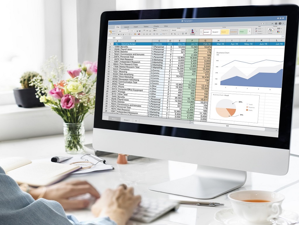
Data modeling is one of the most important steps in creating effective reports and dashboards in Power BI. It ensures that the data "talk" to each other and that analyses are performed logically.
The most recommended modeling approach for Power BI is... star schema.
In this model:
- You have one or more fact tables (with numerical data and metrics, such as sales, costs, profit)
- And several dimension tables (such as customers, products, dates, regions), which connect to the fact table.
The star schema model makes data easier to read, improves report performance, and prevents errors in filters and charts.
Best practices for modeling in Power BI
If you haven't done one yet Power BI extension course, It's normal to find data modeling a bit complicated at first.
But the good news is that, with a few simple tips, you can already structure your data in a way that makes this process much easier.
Below are some modeling tips for Power BI!
- Give clear names to the tables and columns: This makes navigation easier and avoids confusion when creating visualizations.
- Avoid many-to-many relationships: Prefer one-to-many relationships between facts and dimensions to ensure consistency.
- Create a Calendar Table: Essential for period-based analysis (month, quarter, year, etc.). It allows you to use time functions in Power BI more efficiently.
- Remove columns and tables that will not be used: This makes the project lighter and faster to load.
- Use measures with DAX: Calculate key metrics such as total sales, average revenue, conversion rate, etc., using custom DAX formulas.
Conclusion
Power BI is a powerful tool for transforming raw data into reports and dashboards that generate real insights for businesses and professionals.
With it, you can view information clearly and interactively, track metrics in real time, and make decisions based on reliable data.
In this post, you learned how to create a dashboard in Power BI and received essential tips for modeling your data within the program.
Because it is a robust tool, Power BI can seem complex to use, which is why many professionals choose to take extension courses to master all the possibilities it offers.
If you want to delve even deeper into the subject, the ESEG College It offers Power BI courses aimed at those who want to further enhance their resume and stand out in the job market.
Come and meet our continuing education courses for professional growth!