





How to create a dashboard in Excel? 7 steps!
Creating a dashboard in Excel is one of the most practical ways to gather and visualize important data in one place.
It allows you to integrate different spreadsheets into a single document., facilitating access to information and providing a clear and organized view of the most relevant indicators for your business.
Therefore, you can track financial metrics, marketing, productivity, sales, team performance, inventory control, among many others, all in a dynamic and visual way.
Although it may seem complicated at first glance, Creating dashboards in Excel is simpler than you think.
And even if you need extra help, there are many tutorials and Excel courses for businesses that can help you master this essential tool for the job market.
In this content, we will show you How to create a dashboard in Excel, Which tools to use and how to create amazing visualizations that can highlight your work and facilitate strategic decision-making.
What is a dashboard?
Dashboard, which means control panel in Portuguese, is a tool that brings data together in one place, making it easier to visualize and control the information completely.
With it, you can track metrics and make decisions based on clear and well-organized data.
Platforms like WordPress, Google Analytics, and Facebook Ads use dashboards to display statistics and performance indicators in an intuitive way, allowing users to monitor results in real time.
But this feature is not limited to large systems only.
Excel, in addition to being a powerful tool for calculations, data organization, chart creation, and information analysis, can also be used to create customized dashboards.
What is a dashboard in Excel?
An Excel dashboard is an interactive visual panel that brings together the most important data from a spreadsheet in one place, using... charts, tables and visual indicators.
It allows you to analyze information quickly and intuitively, making decision-making easier.
For example, instead of analyzing extensive rows and columns of raw data, You can create a dashboard that shows total monthly sales, the best-selling product, performance by region, and other insights. — all with just a few clicks.
Is it possible to create a dashboard in Excel?
Yes! It's entirely possible to create a dashboard in Excel, and you don't need to be an expert to do it.
With the features that Excel itself offers—such as pivot tables, charts, slicers, and conditional formatting—you can create complete and professional dashboards. The process involves:
- Organize the data into tables;
- Create summaries using PivotTables;
- Generate charts based on these summaries;
- Bring everything together in one visual tab (the dashboard);
- Apply filters and customizations.
It's a great way to turn data into decisions.
See below for a step-by-step guide on how to create a dashboard in Excel!
How to create a dashboard in Excel in 7 steps?
Create a dashboard in Excel. It's a practical and visual way to transform raw data into valuable information for decision-making.
Dashboards are widely used by companies to keep teams aligned with key operational indicators. With a well-designed dashboard, it's possible to track trends, identify flaws, and act quickly.
Below, you'll find a complete step-by-step guide to... How to create a dashboard in Excel from scratch.
1. Plan your dashboard.
Before opening Excel, define the purpose of your dashboard:
- What information do you want to display?
- What will be the focus of the analysis (sales, productivity, performance)?
- Which indicators and charts make sense?
This step is essential to ensure agility in development, as it helps to visualize what data will be used, how it will be presented, and what calculations will need to be performed.
This planning can be done in a tab within the spreadsheet itself or even on paper. The important thing is to create an outline of the dashboard's structure.
2. Organize the database.
After you have the plan in hand, organize the database in a clean and structured way.
To do this, open Excel and create two tabs:
- “"Data": where will your information base be located
- “"Dashboard": where you will build the visual charts and controls
Ensure that the data is:
- With clear titles in the columns
- No blank lines and columns
- To format the database as a Table: select the database > “Home” > “Format as Table”
This will facilitate automatic updates and allow for more efficient use of features such as PivotTables and PivotCharts.
Tip: Excel allows Importing data from different sources (spreadsheets, databases, CSV files, etc.), which expands the possibilities of the dashboard.
3. Create the PivotTables
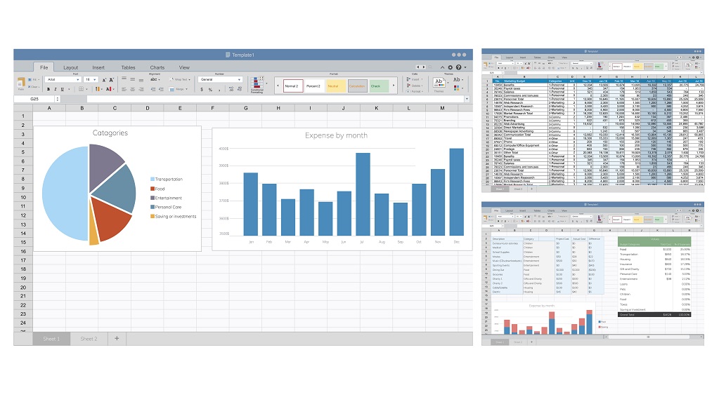
A Pivot Table It allows you to reorganize data in a practical and flexible way, facilitating analysis by category, period, region, and other criteria.
Whenever the database is updated, the PivotTables can be quickly updated as well.
To create a dynamic spreadsheet in Excel, do the following:
- Select the database (Ctrl + Shift + Space also works)
- Go to “Insert > PivotTable”
- Choose to create in a new spreadsheet.
- In the panel on the right, drag the fields according to the type of analysis.
Example:
- “"Category" in Lines
- “"Total Sales" in Values
- “"City" in Columns
Create as many Pivot Sheets in Excel as needed, one for each type of analysis that will be displayed on the dashboard (e.g., by unit, sector, month, product, etc.).
See below how to create a chart from a pivot table!
4. Create Dynamic Charts
With the PivotTables ready, create PivotCharts to visually represent the data.
- Select a PivotTable
- Go to “Insert > PivotChart”
- Choose the type of chart (column, pie, line, bar, etc.)
- Personalize with titles, colors, labels, and styles (brush icon)
- Click the "+" button in the upper right corner of the chart to add or remove elements such as data labels and legends.
Extra adjustment: To hide the chart field buttons, go to “PivotChart Analysis” > “Field Buttons” > “Hide all”
Create a dynamic chart for each PivotTable needed to build the dashboard in Excel.
5. Add data segmentation (visual filters) and Report Connections
To make the dashboard interactive, add Data Segmentation (Slicers).
They function as visual filters — when you click on a value, all the charts connected to it update automatically.
To configure:
- Select a PivotChart or PivotTable.
- Go to “"Analyze" > "Insert Data Segmentation"”
- Choose the filter fields (e.g., Year, Product, Region)
- To connect the slicers to all charts, right-click on the slicer > “"Report Connections"” and select all PivotTables that should respond to the filter.
Repeat the process to insert as many segmentations as needed.
6. Create the dashboard layout
Now that the charts are ready, go to the tab. “Dashboard” and assemble the visual layout of your dashboard.
For that:
- Copy the graphs (Ctrl+C) and paste (Ctrl+V)
- Organize the elements visually.
- Use shapes, text boxes and colors to highlight titles and sections
- Avoid information overload: keep the layout clean and intuitive.
Tip: To hide rows in the spreadsheet, use the tabs. “Display” > uncheck “Gridlines” to hide the background and create a more professional look.
7. Update whenever necessary.
To update the dashboard after adding new information to the database, do the following:
- Right-click on any PivotTable or Slicer.
- Select “"To update"”
If you correctly configure the Report Connections (step 5), all charts will be automatically updated according to the filters.
Dashboard vs. Report: what's the difference?
- Report: It presents the data in a descriptive way, requiring the reader to interpret the information.
- Dashboard (Control Panel): It is a visual interface that highlights key information and facilitates decision-making in just a few seconds.
How do I transform a pivot table into a dashboard?
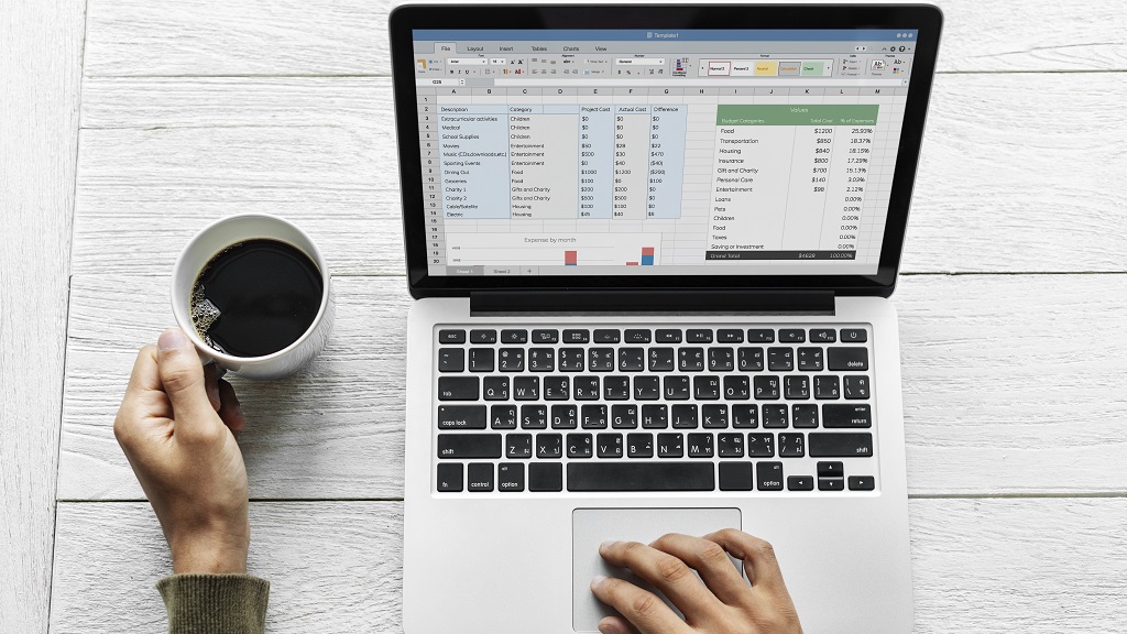
To transform a Pivot table in a dashboard., The secret lies in adding dynamic charts., Apply data segmentation (interactive filters) and organize the elements visually in a dedicated tab.
This way, you transform a simple table into a visually appealing and easy-to-interpret dashboard.
If you follow step 3 onwards, you will be able to transform your pivot table into a highly interactive dashboard in Excel.
But don't stop there! Keep reading to discover other tools and resources that can make your dashboards even more professional and impactful.
What's the best program for creating a dashboard?
The best program for creating a dashboard depends on your objective and level of complexity. For simple and accessible dashboards, Excel is one of the best options — easy to use, with good charting and pivot table tools.
For more advanced analyses and interactive visuals, platforms such as Power BI, Tableau and Google Data Studio They stand out. Each one has its advantages:
- Excel: Ideal for quick dashboards and integration with spreadsheets.
- Power BI: Great for handling large volumes of data and integrating with other sources.
- Tableau: Excellent for more sophisticated and interactive visualizations.
- Google Data Studio: Free and integrated into the Google ecosystem.
If you're just starting out, Excel is a great place to begin, but if you want to delve deeper, there are many Power BI courses on the market that will give you a broader understanding of the tool, even if you're still a beginner.
If you want to create amazing dashboards, ESEG College, part of the Etapa Group, offers a course. Power BI extension course e several Excel courses For professionals who want to advance in their careers.
Visit our website and discover our courses!